
Discover
History and background
Rough Trade began in 1976 as a small independent record shop in London that quickly became a hub for punk and alternative music, later spawning the influential Rough Trade Records label and expanding into a network of stores in the UK, US and beyond, known for championing independent artists and vinyl culture.
Its website, roughtrade.com, serves as an online extension of this legacy where visitors can browse and purchase a wide range of vinyl, CDs, books and merchandise and pre-order exclusive releases.

Reputation


The overall service receives consistent praise for being excellent, with many expressing their satisfaction and intent to continue purchasing from this company.
- Trustpilot
UX initial thoughts
Overall, the Rough Trade website delivers a clean, minimalist experience with strong UX that resonates with its target audience of vinyl collectors and music enthusiasts. Its design emphasises visual clarity and brand identity, while maintaining ease of use for shopping and discovery.
User interface 'look and feel'
-
Minimalist design with ample whitespace highlights vinyl artwork and artistic elements.
-
Consistent black-and-white buttons reinforce retro branding (as does the gold tertiary colour) while remaining clear and clickable
-
Rolling banner is noticeable without being distracting.
-
Subtle animations (e.g., vinyl rolling out of sleeve) enhance brand identity without disrupting usability.
User journeys
-
Intuitive 'Amazon-style' shopping flow with easy basket management and purchase review.
-
Cookie settings are easy to locate and adjust.
-
Prominent central search bar enables quick catalogue navigation.
-
Simple, logical account management flow.
Accessibility
-
High accessibility from the black-and-white colour scheme.
-
Subtle animations (e.g., vinyl rolling out of sleeve) enhance brand identity without disrupting usability.
-
Support widget offers a clear self-service interface with FAQ shortcuts.
Information architecture
-
'RT 50' placed first in the menu prioritises storytelling over shopping, which may confuse new users (consider moving it lower).
-
Overlapping navigation options ('Browse' 'Music' 'New + Trending' 'Used Vinyl' could confuse users; streamlining these paths would improve clarity.
Define
The market
After benchmarking several popular online vinyl retailers, I identified a two common features that could enhance the Rough Trade website: a customer reviews section and the option for users to create a wishlist.
Website
Discogs
HMV
Amazon
Bandcamp
Record Scanner
Review section
Wishlist
I also noticed a feature on the Record Scanner app where the download animation uses a spinning vinyl graphic, which I felt could be an engaging and on-brand interaction to incorporate.
The behaviour
Review section
-
Most online shoppers say reviews influence their buying decisions and see them as essential when deciding what to buy (Marketing Experiments, 2015).
-
Shoppers scan reviews quickly and look for visual summaries (average rating, distribution, recentness) rather than reading every comment in depth (Ibid.)
-
Products with several reviews (around five or more) are dramatically more likely to be purchased than products with none, because reviews reduce uncertainty and build trust (Behavioural eCommerce, n.d.).
Theory: Reviews would benefit Rough Trade by helping vinyl shoppers quickly assess releases, reduce uncertainty, and build trust, making records with multiple reviews more likely to be purchased.
Wishlist
-
Users add items they want but can’t buy yet (budget, timing, still deciding) (NM Group, 2018).
-
Wishlists act as shortlists that reduce decision effort versus re‑browsing a full catalogue (Ibid).
-
Saving items creates a light sense of ownership, which increases attachment and purchase likelihood (Devrims, 2024).
-
Wishlists are often used for gifting and sharing 'what I’d like' lists (Clickconversion, n.d.)
Theory: a wishlist would be effective because vinyl collectors browse thoughtfully, consider budgets, and take time deciding; saving records helps them track rare or high-value items, build attachment, and share gift ideas.
The reality: contextual inquiry
I conducted a contextual enquiry on the Rough Trade website, followed by short semi-structured interviews with two casual vinyl buyers. Participants were first observed while browsing the site to find a vinyl they would consider buying. After the task, they were asked a few follow-up questions about their decision-making and overall experience.
The goal of this research was to understand their natural browsing behaviour and their emotional response to the current digital experience. Both sessions took around 15 minutes.
There were two key findings from the research:
Lack of social proof creates hesitation
-
Participant B scrolled down expecting reviews.
-
When asked, both participants indicated that they would find a review section valuable.
-
"It's nice to hear people's opinions on vinyls I've never heard before." - Participant A
-
"Reviews make you feel part of a community" - Participant A
Users rely on social proof to feel confident and connected, indicating a review section would reduce hesitation in purchasing.
Consideration before commitment
-
Participant A took screenshots of records they were interested in and opened multiple tabs to compare options, highlighting a need to track potential purchases.
-
Unprompted, Participant A suggested that being able to create a wishlist would improve the experience.
-
"It's fun to make lists of vinyls" - Participant B
-
At the end of the session, when asked, Participant B agreed that a wishlist feature would be a useful addition.
Users naturally try to organize and track vinyls of interest through screenshots, tabs, or lists, highlighting the need for a wishlist to support non-transactional browsing and simplify planning purchases.
At the end of the research session, I showed the participants the spinning vinyl download animation feature of the Record Scanner app that I had discovered during benchmarking. Both participants responded positively, saying they liked it and felt it would enhance the user experience.
Personas
Michael
Browses widely, buys occasionally, relies on others’ opinions to guide decisions.
Wants:
-
Ratings at a glance
-
Recent reviews
-
Reassurance before committing
Pain Points:
-
Feels unsure without reviews
-
Doesn’t want to waste money on a bad pick
-
Product pages feel impersonal
Andrea
Budget-conscious vinyl fan who plans purchases carefully and compares options.
Wants:
-
A wishlist to track records
-
Easy way to shortlist favourites
-
Time to decide before buying
Pain Points:
-
Uses screenshots to remember items
-
Opens too many tabs
-
Forgets records she liked
Opportunities
Provide quick visual summaries (ratings, count, recentness) to reduce uncertainty, build trust, and strengthen community feel.
Let users save and track records, supporting thoughtful buying, budget planning, and gifting.
Features like a spinning vinyl animation enhance enjoyment and emotional connection with the site.
Develop
Review section
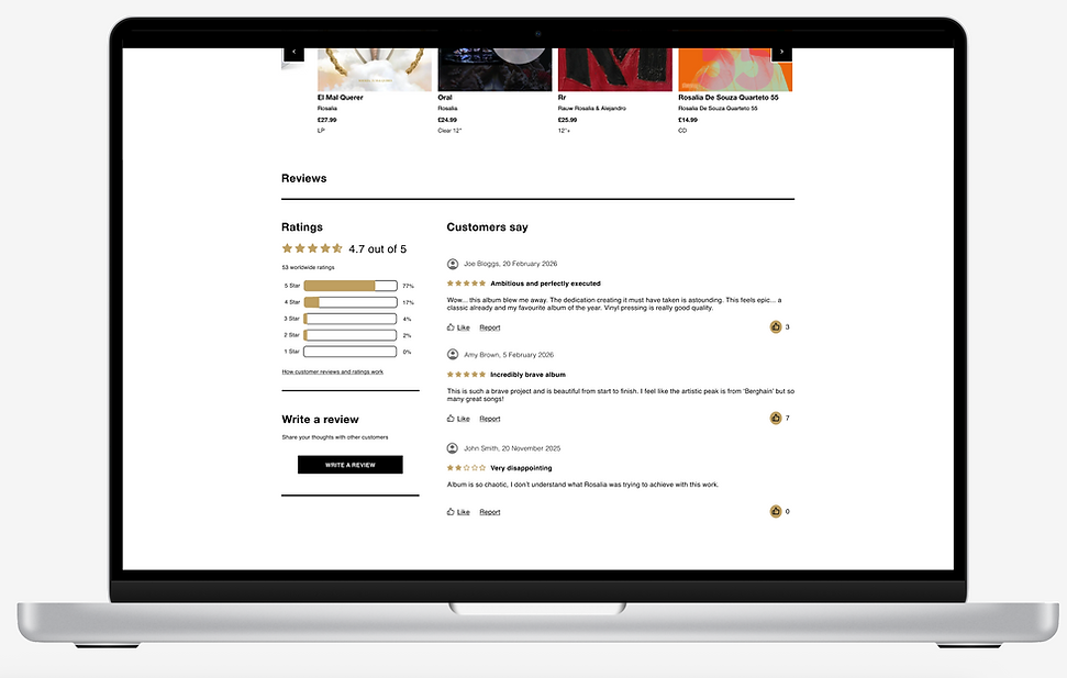
The design leverages gold, the site’s tertiary colour and the natural colour for stars, signalling quality and achievement in ratings. Ratings combine horizontal bars and stars to convey both numeric precision and qualitative feedback, with percentages enhancing transparency and trust. Reviews highlight the author and date for authenticity, while balanced spacing and padding ensure content remains clear and digestible.

I designed a dedicated review page to keep the experience focused and distraction-free. The layout follows a clear visual hierarchy - Product → Rating → Written Review → Title → Submit - guiding users naturally through the process. Simple, direct headings like 'Write a review' and 'Title your review', along with helpful placeholder text such as 'What did you think of the vinyl?', provide subtle guidance and reduce friction, making the task feel quick and straightforward.
Wishlist


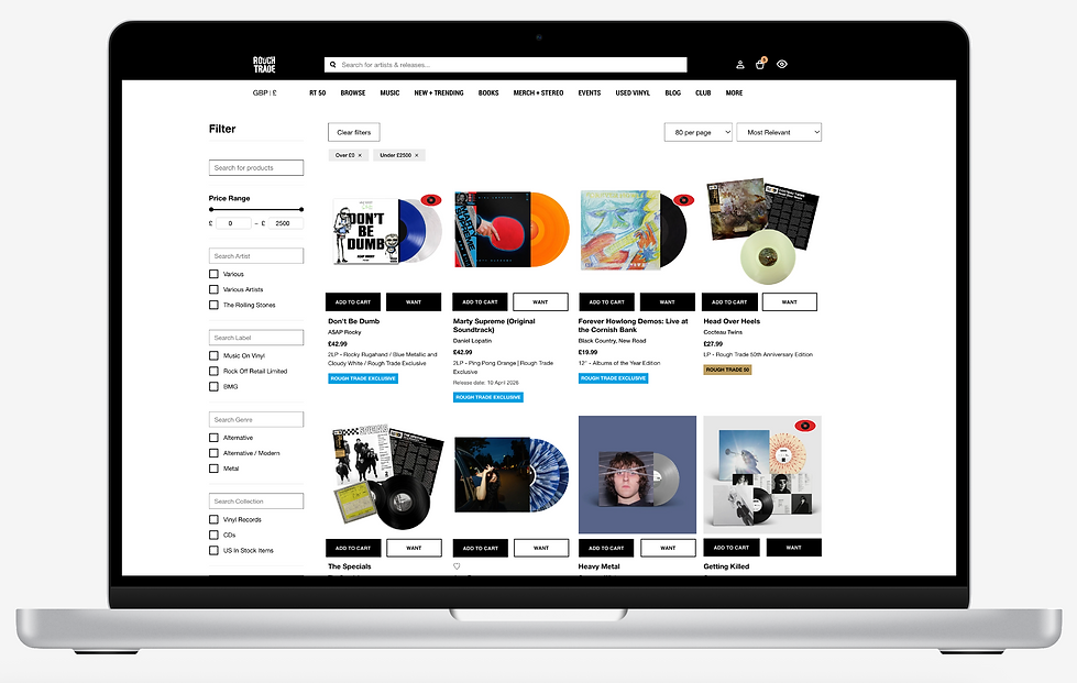
I created this icon to mark vinyl records for the wishlist, placing a vinyl at the centre of the eye to maintain strong visual consistency with the record theme. The bold red ensures it stands out against different vinyl colours for accessibility, while the eye symbol provides clear, intuitive visual language that aligns with the wishlist function and connects to the eye icon used at the top of the page to access the wishlist.
I used white 'Want' buttons with a black border to reinforce the brand’s black-and-white palette and retro feel while maintaining accessibility; on hover and click the button turns black, and since the red vinyl eye icon appears to show it’s been added to the wishlist, it’s immediately clear the action was successful.

Vinyl loading animation

I designed a branded vinyl loading animation to make the waiting experience feel intentional rather than passive. The vinyl features the Rough Trade logo at its centre, turning the loading state into a subtle brand touchpoint. The vinyl will spin continuously with animated dots fading in and out to indicate progress, and at intervals it will slow and pause with the logo upright before spinning again, creating a rhythmic and engaging transitional state.
Deliver
Hi-fi prototypes
Review section
Wishlist
Vinyl loading animation
Reflecting on the process
Exploring Rough Trade’s context, including the company’s history and customer feedback, helped clarify what matters to users and what the brand stands for. It highlighted where assumptions could mislead and where design attention could have the most impact.
Initial UX thoughts focused on how to make browsing feel intentional and emotionally engaging, considering why vinyl buyers browse, where they might hesitate, and how the experience could feel more reassuring or playful. Taking the time to reflect on these ideas before research helped set a direction and ensured observations would be purposeful rather than exploratory for its own sake.
The contextual inquiries and interviews revealed behaviours and emotional needs that might otherwise have been overlooked. These sessions made it clear that small, thoughtful design choices could meaningfully improve the experience. One thing that has become apparent reflecting now is that including a broader variety of user types, such as more experienced collectors or gift-buyers, might have uncovered additional patterns and priorities.
Creating personas at the stage I did so was particularly effective. They translated observations into relatable archetypes, making motivations and pain points tangible, and provided a reliable reference for design decisions.
Looking back, this sequence - context, initial UX thoughts, observation, personas, design and prototyping - created a clear progression from understanding users to informing design decisions, ensuring the final designs and hi-fi persona were grounded in observed behaviours and real needs.